Here’s our top 3 tips for stopping your slides looking like PowerPoint®.
1. Limit bullet points and text
Your presentation is for the benefit of the audience. But boring an audience with bullet point after bullet point is of little benefit to them. Which brings us to the issue of text. The best slides may have no text at all. This may sound insane given the dependency of text slides today, but the best PowerPoint® slides will be virtually meaningless without the narration (that is you). Remember, the slides are meant to support the narration of the speaker, not make the speaker superfluous. Many people often say something like this: “Sorry I missed your presentation. I hear it was great. Can you just send me your PowerPoint® slides?” But if they are good slides, they will be of little use without you. Instead of a copy of your PowerPoint® slides, it is far better to prepare a written document which highlights your content from the presentation and expands on that content. Audiences are much better served receiving a detailed, written handout as a takeaway from the presentation, rather than a mere copy of your PowerPoint® slides.
If you have a detailed handout or publication for the audience to be passed out after your talk, you need not feel compelled to fill your PowerPoint® slides with a great deal of text. Please remember to never, ever turn your back on the audience and read text from the slide word for word. It’s the ultimate sign of the amateur.
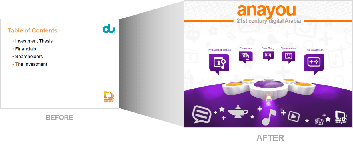
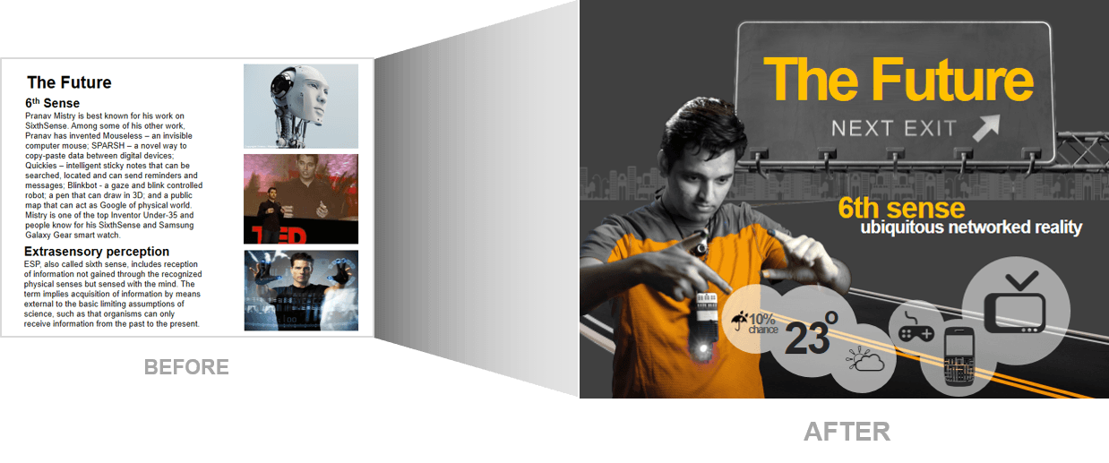
2. Use high-quality infographics including photographs.
Be creative with your presentation. You can take your own high-quality photographs with your digital camera, purchase professional stock photography, or use the plethora of high-quality images available on line (be cautious of copyright issues, however). Never simply stretch a small, low-resolution photo to make it fit your layout – doing so will degrade the resolution even further, resulting an out-of-focus image which is a sign of the amateur. Avoid using PowerPoint® Clip Art or other cartoonish line art. Again, if it is included in the software, your audience has seen it a million times before. It may have been interesting in 1993, but today the inclusion of such clip art often undermines the professionalism of the presenter. There are exceptions, of course, and we love using professional looking infographics such as the examples here: http://audiencealive.com/presentation-design/#infographic.
Also learn how to remove the backgrounds from your images using the picture background removal tool in PowerPoint 2010 and later. Find out how here: https://www.youtube.com/watch?v=32ddggO6_KM
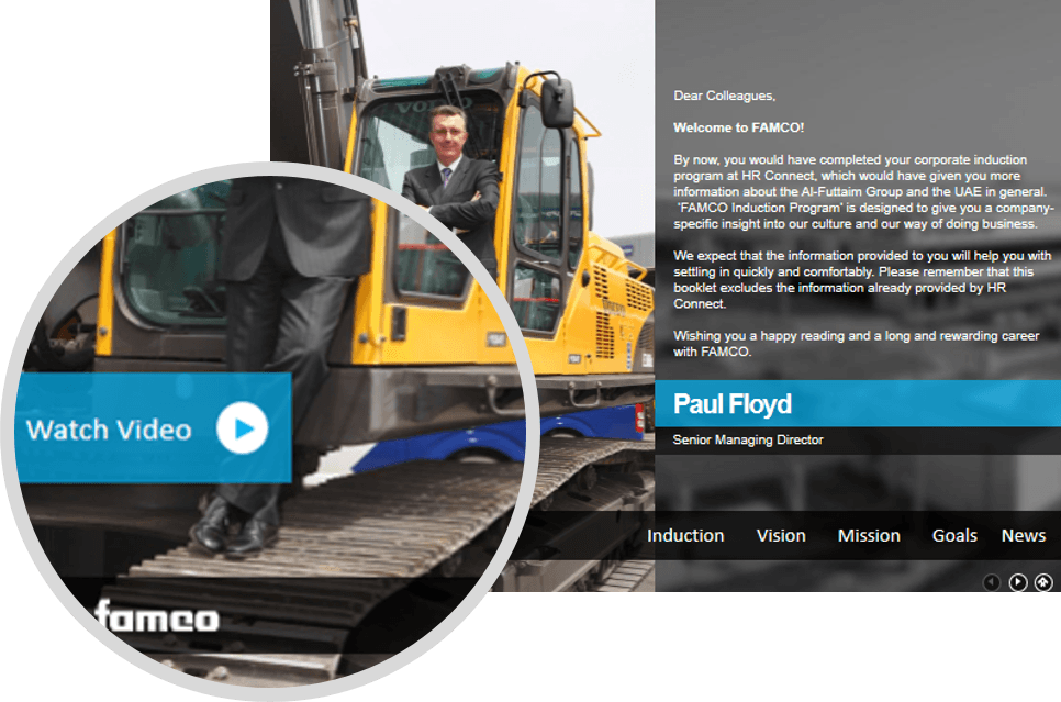
3. Use video and audio when appropriate.
Using video clips to show concrete examples promotes active cognitive processing, which is the natural way people learn. You can use video clips within PowerPoint® without ever leaving the application. Using a video clip not only will illustrate your point better, it will also serve as a change of pace thereby increasing the interest of your audience. You can use audio clips (such as interviews) as well. Something to avoid, however, is cheesy sound effects that are included in PowerPoint® (such as the sound of a horn or applause when transitioning slides). The use of superfluous sound effects attached to animations is a sure way to lose credibility with your audience. Getting video is easy especially if you use the “ss” application https://www.youtube.com/watch?v=YhfVnEz6MCM
This is by no means an exhaustive list of options but if presenters simply applied these three tips to their presentations the world would be a better place with more engaged audiences.
For more Tips and ideas subscribe to our mailing list below.